
Project brief for a Claremont hospitality fit-out
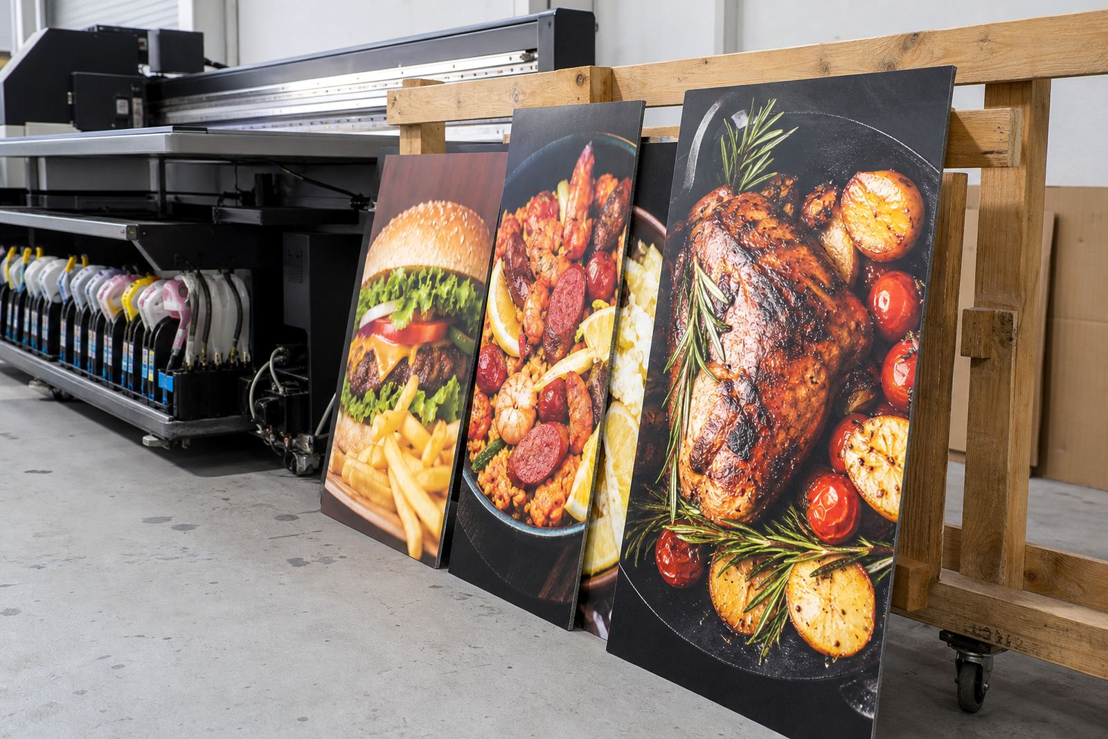
The client was a hospitality operator in Claremont, Cape Town looking for menu boards and interior graphic pieces that could handle daily use without losing colour or clarity. The boards had to sit neatly in a customer-facing area, work with the existing interior finishes, and stay readable under warm indoor lighting as well as daylight from nearby windows. We worked from supplied artwork and layout notes, then checked how the print would read at viewing distance, since a menu board that looks fine on screen can read very differently once it is hung above a counter.
Because the space serves food and drinks throughout the day, the graphics also needed a practical surface that could be wiped down. The client wanted a tidy result with no visual clutter, and the job had to be completed within a short programme so the site could keep moving. We planned the print run, colour checks and mounting sequence to keep the turnaround tight, with final install completed over 2 weeks. The finished pieces were made for everyday use rather than showpiece display only, which is often the right answer in hospitality where wear and tear starts fast.
What we supplied and why it worked
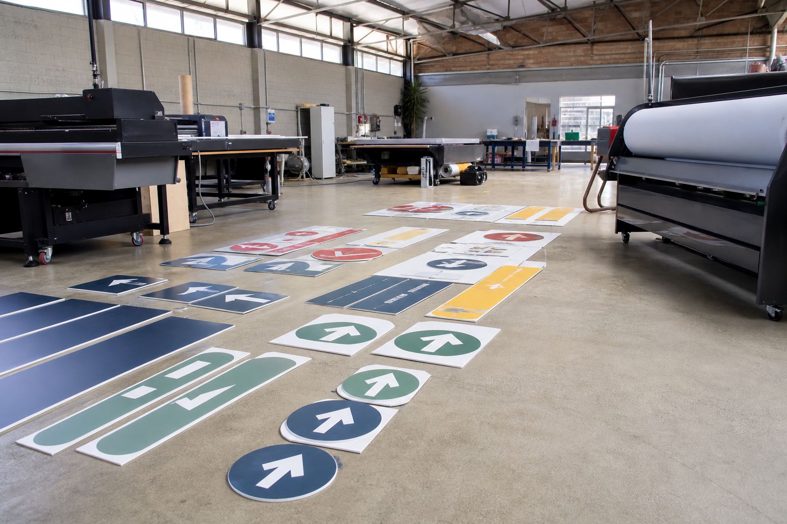
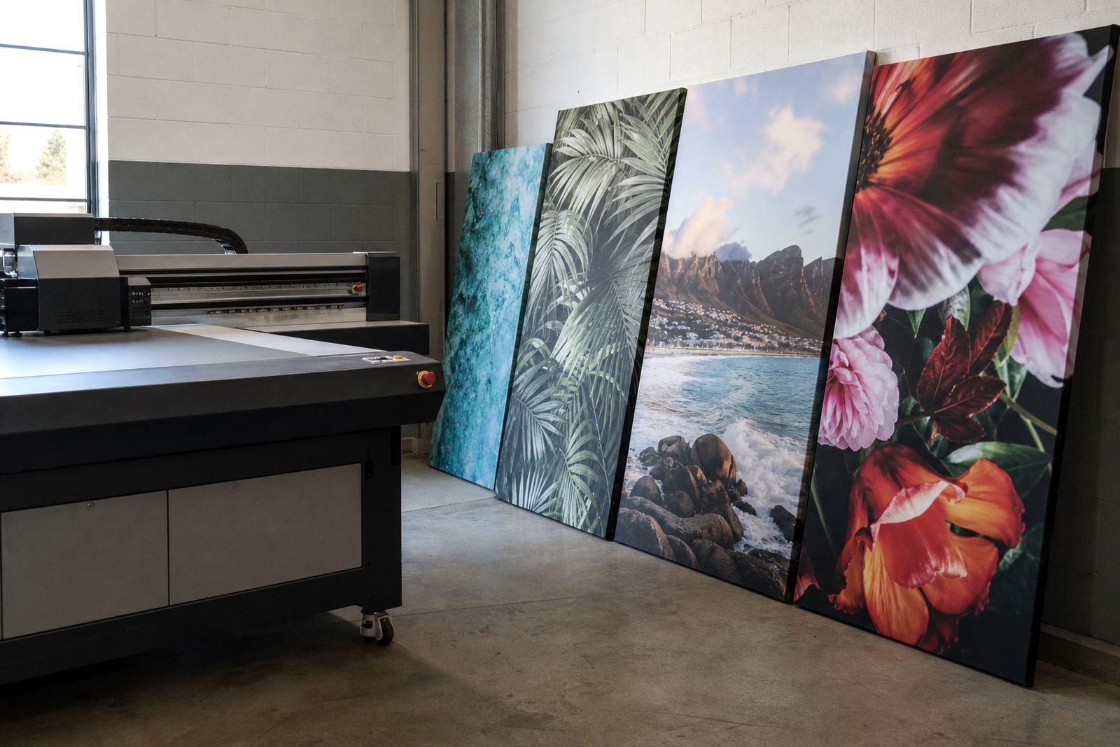
We printed the menu boards and interior pieces using UV-curable inks suited to flat panel and rigid display work. UV curing hardens the ink as it is exposed to ultraviolet light, which helps the print sit on the surface with good detail and a clean finish. For this kind of Claremont site, that matters because the graphics need to stay presentable even where there is regular handling, cleaning and moisture in the air. We also checked adhesion on the selected board material so the finish would remain stable after mounting.
We kept the graphics consistent across the set so the customer area would feel ordered rather than pieced together. The final boards were sized for clear legibility at counter distance and from a short walk-in line, with enough contrast to stay readable in a busy room. One board was set for higher traffic viewing and another for quieter interior placement, so the same visual language could work across the whole space.
- UV-curable print on rigid menu board material
- Interior graphic pieces matched to the same colour set
- Surface checks for adhesion before mounting
- Clean edges and practical wipe-down finish
- Layout set for viewing at counter and wall distance
Printing limits on this job and how the ink plan was adjusted
Hospitality projects in Cape Town often have a few moving parts at once, and this one was no different. The site needed the graphics to be fitted without blocking service, and the boards had to be measured against existing walls, counters and light fittings. We also had to keep in mind the local conditions that affect printed work, especially the mix of coastal humidity and temperature changes between day and night. That is where the right curing and handling process makes a difference, because a board that is not properly prepared can show issues later on.
There was also a practical need to coordinate access during business hours. The install area had limited space, so the pieces had to be delivered in the correct order and mounted with minimal disruption. We organised the work so the client could keep trading around us, and we used a simple step by step plan that covered delivery, placement, alignment and final check off. No drama, just careful sequencing and a bit of patience. The result was a neater finish and fewer delays, which is usually the best way to handle a live hospitality site.
- Need to work around trading hours
- Humidity and cleaning exposure in a coastal city
- Clear positioning for overhead and wall-mounted pieces
Our process from file check to final mount
We started with a print suitability check on the supplied artwork, then confirmed sizes, crop marks and any text that needed stronger contrast. Once the layout was signed off, we prepared the boards for print and tested the finish on sample pieces where needed. Because UV inks cure quickly, the workflow is efficient, but good results still depend on matching the substrate, curing settings and intended use. That is especially true for interior menu work, where fine type and colour blocks need to stay crisp.
After print and cure, the boards were trimmed and prepared for mounting. We then handled the interior install and final placement so the graphics lined up with the room's layout. The whole job ran over 2 weeks from brief to fit-off, including review, production and delivery planning. Our team kept the client informed at each stage, which helped reduce back-and-forth and made it easier to catch small changes before they became site problems. A quick check on the day saved time later on, and honestly thats often what keeps a hospitality job on track.
- Artwork and size review
- Compatibility and adhesion checks
- UV print and curing
- Trimming and mounting preparation
- Final fit-off and placement review
Results on the floor and what changed for the client
The finished menu boards gave the client a cleaner customer-facing area with better legibility and a more settled look across the interior. The boards held colour well under indoor lighting, and the mounted pieces helped tie the serving space together without overpowering it. For a hospitality setting in Claremont, that kind of result matters because the graphics need to support the room rather than compete with it. The client also gained a set of pieces that could be cleaned carefully without constant worry about damage from light handling.
From a production point of view, the project showed why UV-curable inks remain a solid choice for this type of work. When the print is matched to the right substrate and cured properly, you get good definition, practical handling and a finish that suits everyday use. For another menu board project, we would use that same print plan: confirm the viewing distance early, test adhesion before full production, and plan the install around trading times. That keeps the site calm and the final result tidy.
What we would repeat for the next hospitality project
For the next menu board or interior graphics project, we would use the same careful process with a few practical checks up front. Hospitality work in Cape Town, Johannesburg or Durban can all ask different things from the print, but the basics stay the same: correct substrate choice, proper curing, clean mounting and enough time for a final review. We also remind customers to follow the safety data sheet for the ink and wear gloves when handling product or printed components during prep. That keeps handling safer and reduces avoidable mess on site.
Our Epping, Cape Town base lets us support local production while coordinating We courier UV ink to Cape Town, Johannesburg, Durban, Pretoria, Gqeberha and other centres. We also support Bellville and Paarl deliveries when jobs need a wider Cape Town route. For repeat hospitality work, we can help with sample pack prep, colour trial support, operator training and remote technical help, so the same standard can be kept across multiple sites or future refreshes.
Ink data
| Project type | Hospitality menu boards and interior mounted graphics |
|---|---|
| Town | Claremont, Cape Town |
| Print method | UV-curable ink on rigid display material |
| Turnaround | 2 weeks from brief to fit-off |
| Key considerations | Adhesion, curing, viewing distance and wipe-down use |
| Supply area | Epping base with courier delivery across South Africa |