
Why colour density changes the whole job
Colour density is the amount of visible pigment or colour strength laid down on the material. In UV-curable printing, that choice affects more than appearance. A higher density can improve punch on shop signage, safety labels and graphics viewed from a distance, while a lighter laydown may suit soft branding work where fine detail matters more than strong saturation.
It also changes how the cured film behaves. Too little density can leave prints looking washed out, especially on darker boards or textured media. Too much can make details fill in, slow curing at the surface, or create a finish that feels heavy. The right balance depends on the material, the print speed, the lamp output and the final use of the job.
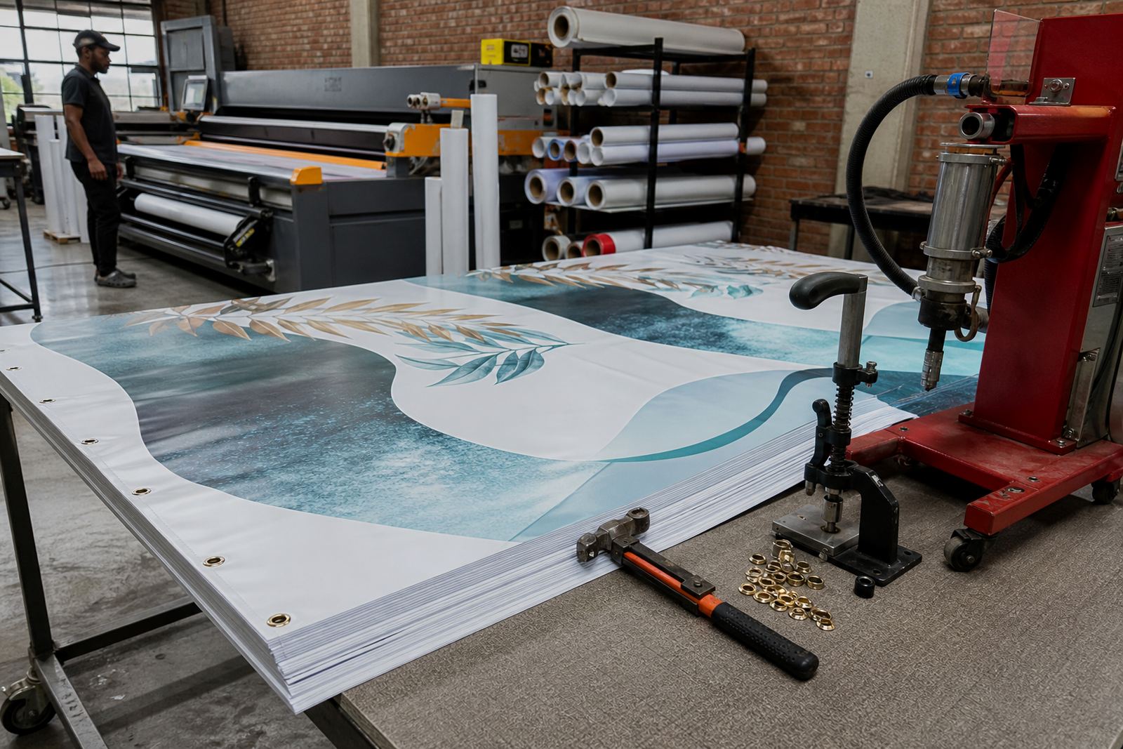
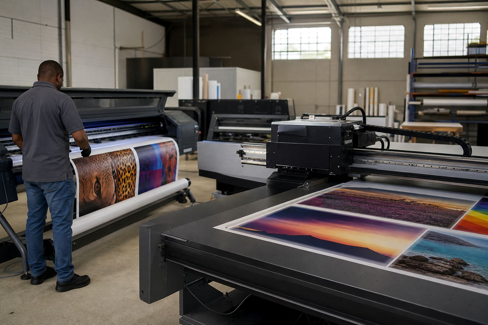
On a busy production floor in Epping, Cape Town, this is the sort of detail that decides whether a short run goes out first time or has to be adjusted and reprinted. The same applies whether the job is heading to Bellville, Paarl or sent by courier to Johannesburg, Durban, Pretoria or Gqeberha.
What density does on dark and unusual materials
Darker substrates usually need stronger colour density because the base material absorbs light and reduces contrast. White, light colours and opaque layers can help, but the actual approach depends on the print sequence and the curing setup. On coloured acrylic, black board, brushed-look panels or textured packaging board, the ink must work harder to stay readable.
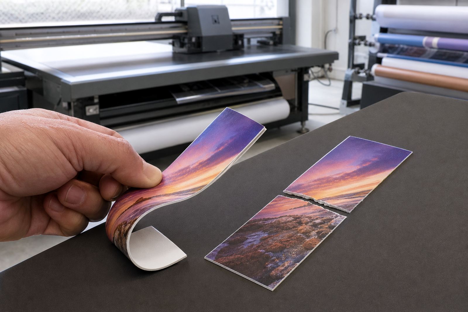
Odd surfaces are where many print teams get caught out. A material that looks smooth in the sample room may behave differently once it reaches production speed. If the surface has release agents, dust, moisture or a slight texture, the same density can cure differently from one sheet to the next. That is why a small test run is worth doing before a full batch.
- Check whether the substrate is absorbent, coated or non-porous
- Look at the viewing distance, close-up detail needs a different density to outdoor signage
- Test on the same batch of material, not only a sample offcut
- Allow for coastal humidity in Cape Town, Gqeberha and Durban, which can affect handling and storage
How curing and density work together
UV-curable ink needs enough energy to cure properly after it lands on the surface. If the density is too high for the curing setup, the top layer may look set but the lower layer can remain under-cured. That can affect rub resistance, adhesion and stackability. If the density is too low, the print may cure quickly but still lack the strength needed for the job.
The answer is usually not to chase maximum density. It is to match ink laydown, lamp output, print speed and substrate type. Flatbed and roll-to-roll systems behave differently, so the same file can need a different approach depending on whether it is going onto rigid panels or flexible media.
For operators, the rule is simple: keep notes on what worked. Record the substrate type, pass count, curing setting and any issues with odour, tack or finish. That history helps on repeat orders and reduces guesswork when production is under pressure.
A practical approach for print teams
Before you commit to a full run, test the job with a small sample pack and judge the result under real lighting. A colour that looks fine indoors can fade badly under bright sun, while a dense print that looks strong on screen may be too heavy on the actual material. In South African retail and industrial settings, visibility often matters more than perfect screen appearance.
When working out colour density, it helps to separate visual impact from process control. The job needs to look good, but it also needs to run cleanly through the printer and cure properly. If the design includes tiny type, fine lines or barcodes, excess density can close them up. If the design is a bold panel or a directional sign, too little density may reduce impact.
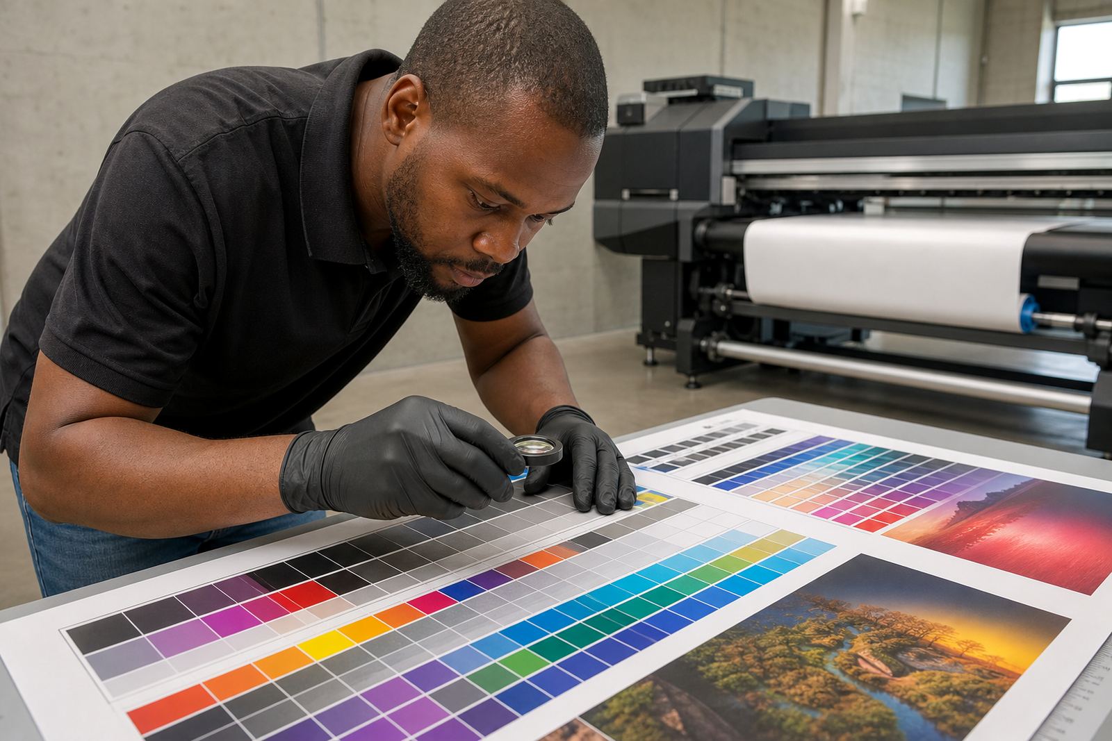
- Start with a test strip before full production
- Inspect fine text, solid fills and gradients separately
- Check drying or cure quality by handling the print after cooling
- Keep a log of ink settings for repeat print runs
- Wear gloves and follow the safety data sheet when handling ink and waste
Ink compatibility matters as much as colour strength
Not every UV-curable ink behaves the same way on every machine. Compatibility covers more than fitting the printer physically. It includes flow, droplet formation, curing response, adhesion and the way the colour builds across passes. A system that runs cleanly at one density may need adjustment when the media, print speed or ambient temperature changes.
This is why a compatibility check is useful before changing ink type or moving a job onto a new substrate. Even a slight difference in formulation can alter how the print builds. That does not mean the ink is wrong, only that the process needs to be checked carefully.
For production managers, a simple question helps: does the current setup give the same result at the same density every time? If the answer is no, the issue may be in the curing, the media handling, or the print profile rather than the artwork itself.
Local example: keeping outdoor signage readable
A Cape Town sign shop producing outdoor wayfinding for a coastal site may face bright sun, wind and salty air. If the density is too low, the directional arrows and small place names can disappear at a distance. If it is too high, the print may look heavy and take longer to cure, especially when the workshop is busy and the material is moving from one station to another.
In that kind of job, a practical middle ground works best. The team can test two or three density levels, check the results in daylight, and compare the cured finish after handling. A slightly stronger build may be needed on darker panels, while lighter areas like logos or pictograms may need less ink to keep detail sharp. That approach saves time, and it makes repeat orders easier when the same sign needs to be produced again months later.
For couriers moving stock to Johannesburg, Durban, Pretoria or Gqeberha, a repeatable density setting is useful because the same file may be printed in different conditions. A controlled process helps keep the result consistent from one region to the next.
What to keep in mind before the next production run
Colour density is one of the easiest places to lose time, but it is also one of the easiest areas to improve. Once the print team understands how density affects cure behaviour, adhesion and visual punch, it becomes simpler to choose the right setting for each job. That means fewer surprises, cleaner handover to finishing and better results on tricky materials.
If a job is important, do not rely on memory alone. Review the substrate, the curing method, the storage conditions and the handling instructions before production starts. When in doubt, use a test piece, follow the safety data sheet, wear gloves and keep the process tidy. A small amount of checking up front can prevent a full batch of rework later on.
For customers working through the enquiry form, the useful information to share is simple: what material will be printed, where it will be used and whether the job needs extra durability, strong readability or a specific finish. That gives the production team a better starting point for selection, testing and print planning.